What are Candlestick charts?
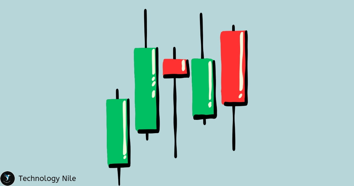
Candlestick charts – Complete Tutorial :
Candlestick charts are type of financial charts it helps us to visualizing price movements of an asset, like a stock or currency, over time.
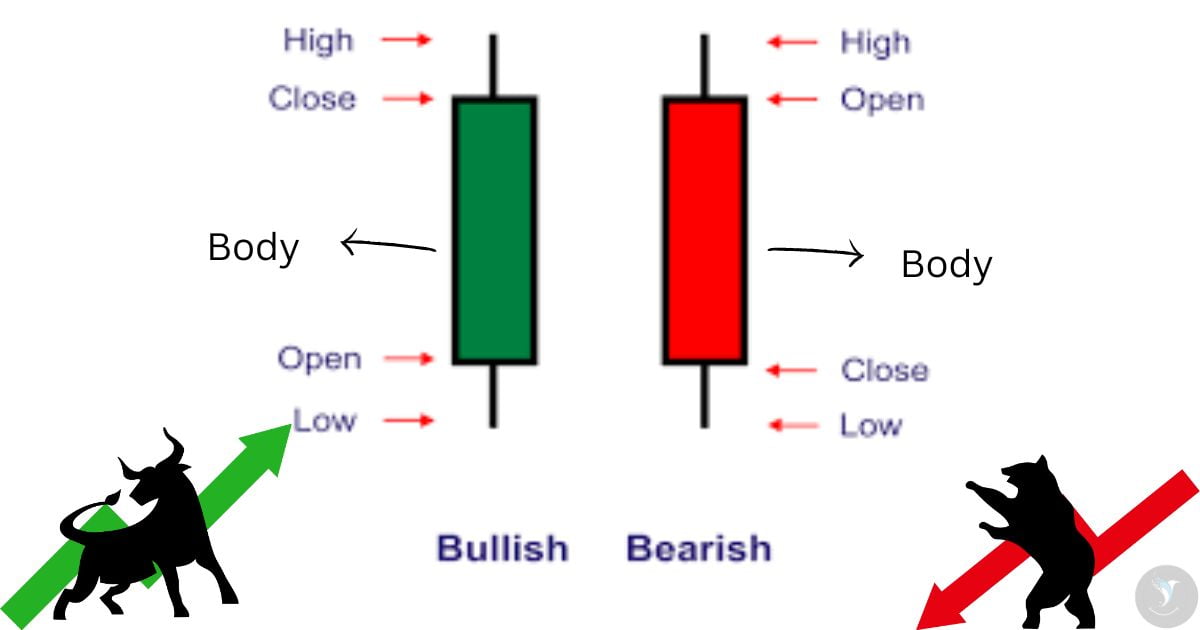
The body: This is the thick part of the candlestick and shows the opening and closing prices for the time period.
The wicks: These are the thin lines extending above and below the body and show the highest and lowest prices traded during the time period.
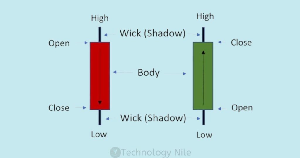
This information can be helpful for traders to analyze price patterns and make decisions about buying or selling.
Green or white for up and red or black for down is common.
- Green or White= Upward price movement trends.
- Red or Black = Downward price movement trends.
What are white and black Candlestick?
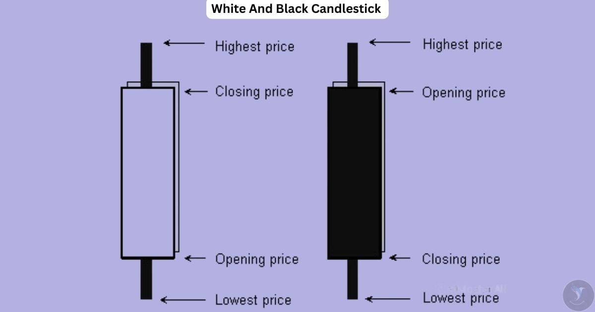
White body: This signifies a bullish period, meaning the closing price is higher than the opening price. It suggests buying pressure and potential price increase.
Black body : bearish period, indicating the closing price is lower than the opening price.
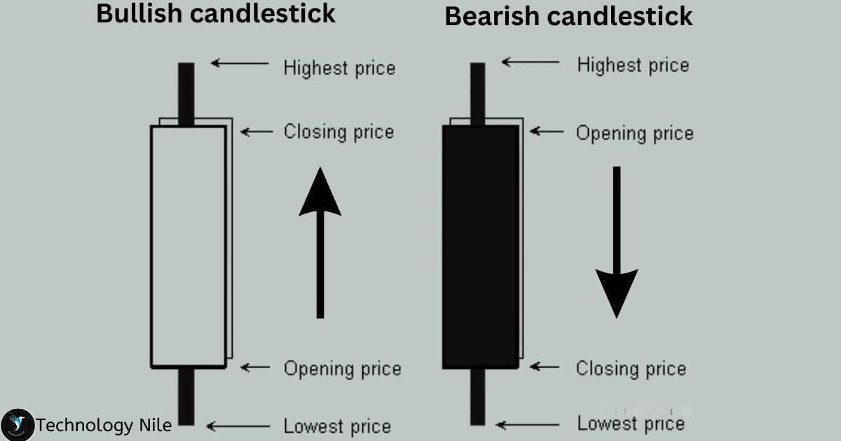
Green or white candlestick in the stock market represents an upward movement in price.Red or black Candlestick in the stock market represents an downward movement in price.
Why to learn Candlestick Charts?
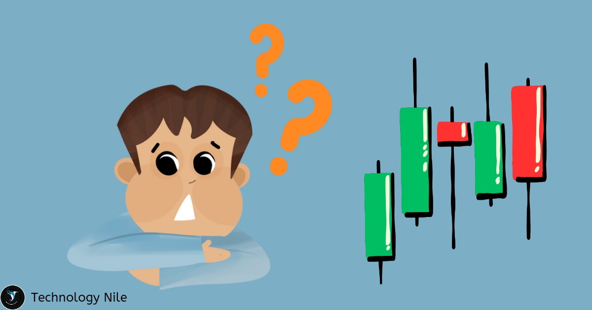
Candlesticks are one of the most popular component of technical Analysis it offer a more visual and intuitive way to understand price movement.
Visualize Price Movement: Compared to other chart types, candlestick charts offer a more visually intuitive way to understand price movement.
Identify Trends and Patterns: By recognizing different candlestick patterns, you can identify potential trends and reversals in the market.
Types of Candlestick Patterns
Bullish Reversal Patterns:
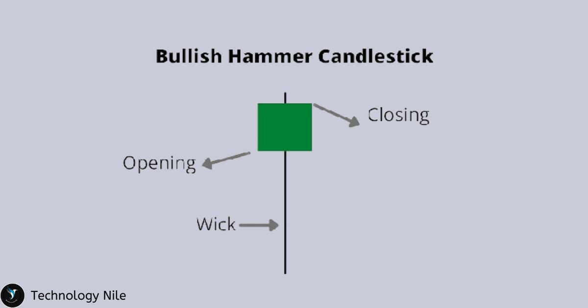
Bullish hammer candlestick
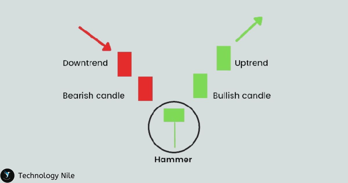
Hammer: A small body sits on top of a long lower wick, indicating buying pressure despite a price drop. It suggests a potential reversal from a downtrend to an uptrend.
A hammer has a long lower wick and a small upper wick, indicating buying pressure at the end of the period. It suggests a potential bullish reversal.
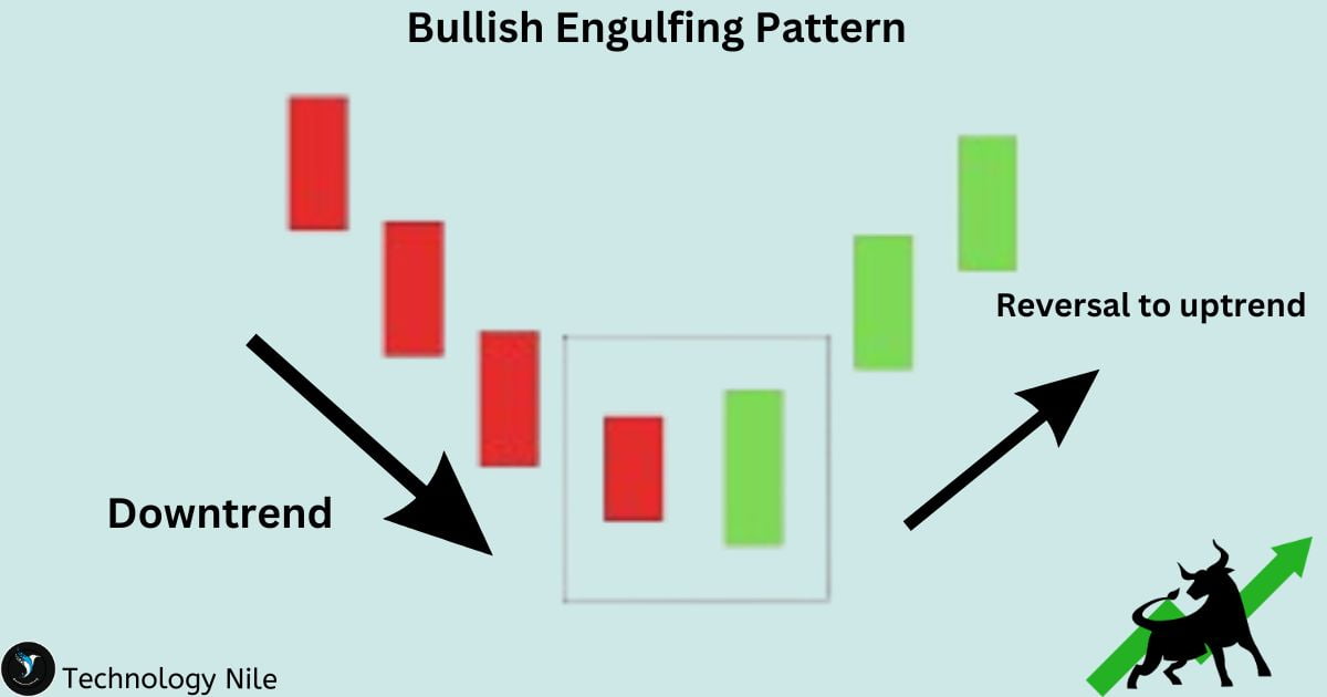
Bullish Engulfing pattern
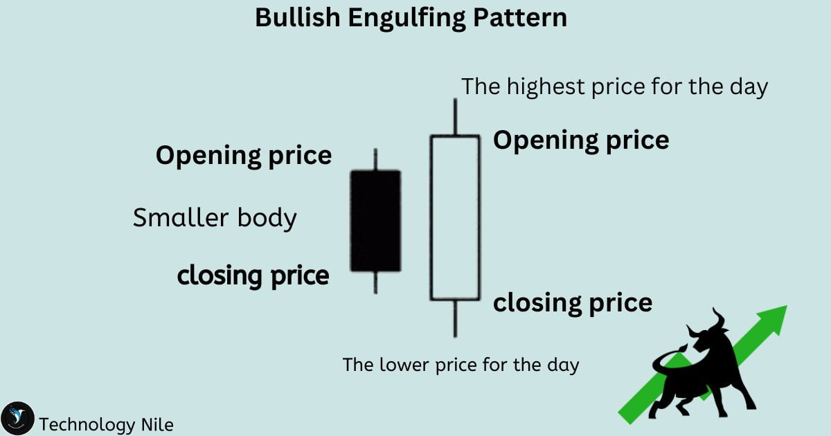
Bullish Engulfing: A long green candlestick completely engulfs the previous red candlestick, signifying strong buying pressure and a potential trend reversal.
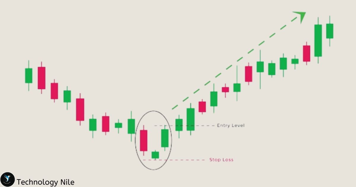
Morning Star Candlestick
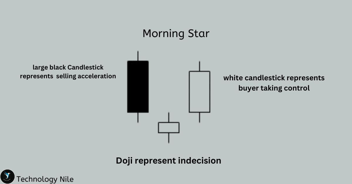
The Morning Star Candlestick is a bullish Reversal Pattern
Three candlesticks form a distinct pattern: a long red candle (downtrend), followed by a small doji (indecision), and then a long green candle (uptrend), indicating a potential bullish reversal.
- The first candle shows the downtrend’s strength.
- The second candle indicates a turning point, with selling pressure subsiding and buyers entering the market.
- The third candle confirms the reversal by decisively pushing the price upwards.
Doji candlestick
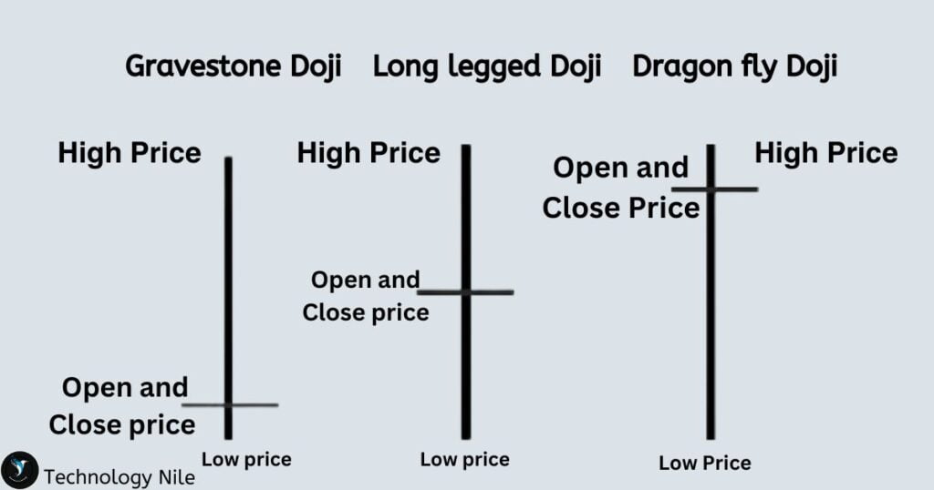
A Doji candlestick is a technical analysis pattern used in trading to identify price movements and potential reversals. It occurs when the opening and closing prices of a security are virtually equal, resulting in a small body and long upper and lower shadows. It highlights the indecision in the market, where buyers and sellers struggle for control, pushing the price up and down but ultimately ending at the same point.
The word “Doji” is a Japanese word meaning “the same thing” or “unchanged.”
Tip : Doji should be avoided as much as possible because Doji candles represent indecision in the market, where the open and close prices are nearly identical.
Hanging man
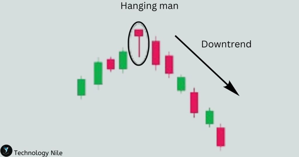
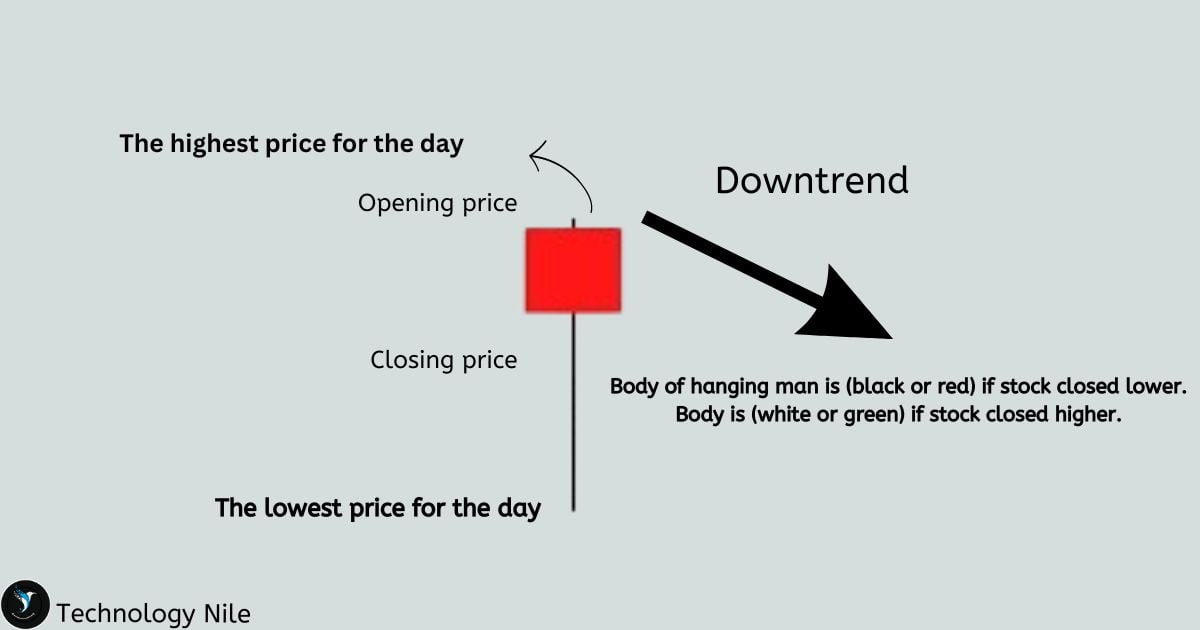
The Hanging Man is a bearish reversal candlestick pattern that signals a potential end to an uptrend and the start of a downtrend.
Similar to a hammer, but with a long upper wick and a small lower wick, suggesting selling pressure at the end of the period. It can indicate a potential bearish reversal.
- It consists of a single candlestick.
- The upper shadow (wick) is short or non-existent.
Evening Star Candlestick
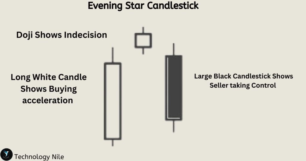
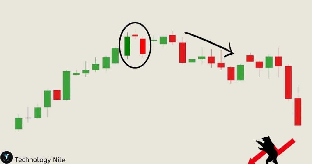
Evening Star Candlestick pattern is a bearish reversal pattern it is used in technical Analysis.it helps us to identify potential declines in an uptrend.
First Candlestick : A large bullish candlestick with a solid green or white body, indicating strong buying pressure and price increase.
Second Candlestick : A small-bodied candlestick, a Doji (open and close are almost the same), representing indecision and a pause in the uptrend.
Third Candlestick : A bearish candlestick with a solid red or black body, closing significantly lower than the second candlestick’s open price, confirming the downtrend reversal.
Three white Soldiers Pattern
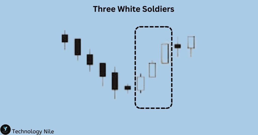
The ” Three White Soldiers ” Candlestick Pattern is a Bullish reversal pattern used in technical Analysis to identify potential upward trend It consists of three consecutive long-bodied candlesticks.
All three candlesticks have solid bodies (green or white), indicating closing prices higher than opening prices.
White Marubozu Pattern
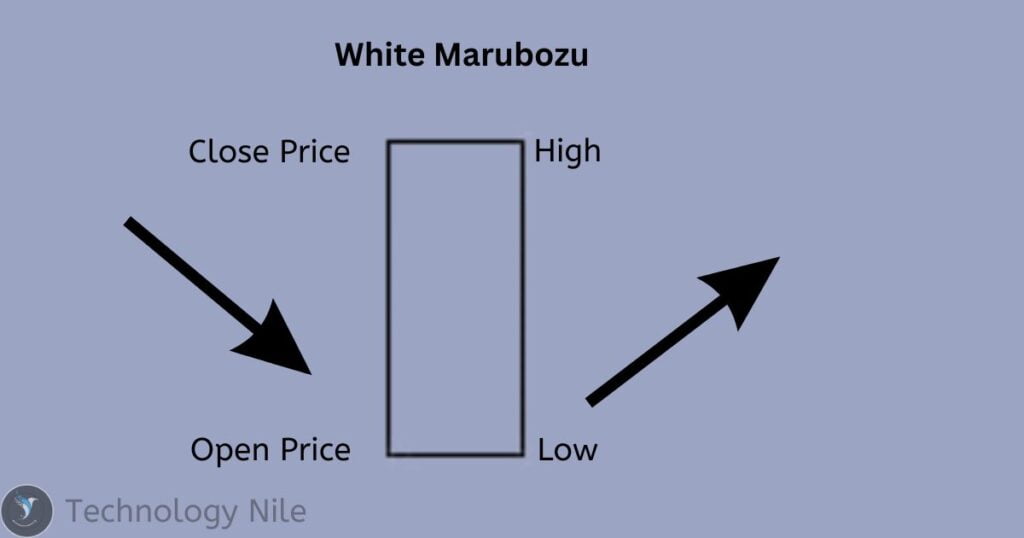
The entire body of the candle is filled with white, indicating the closing price is higher than the opening price.
No Wicks – This means the price never climbed higher than the closing price.
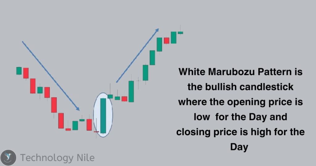
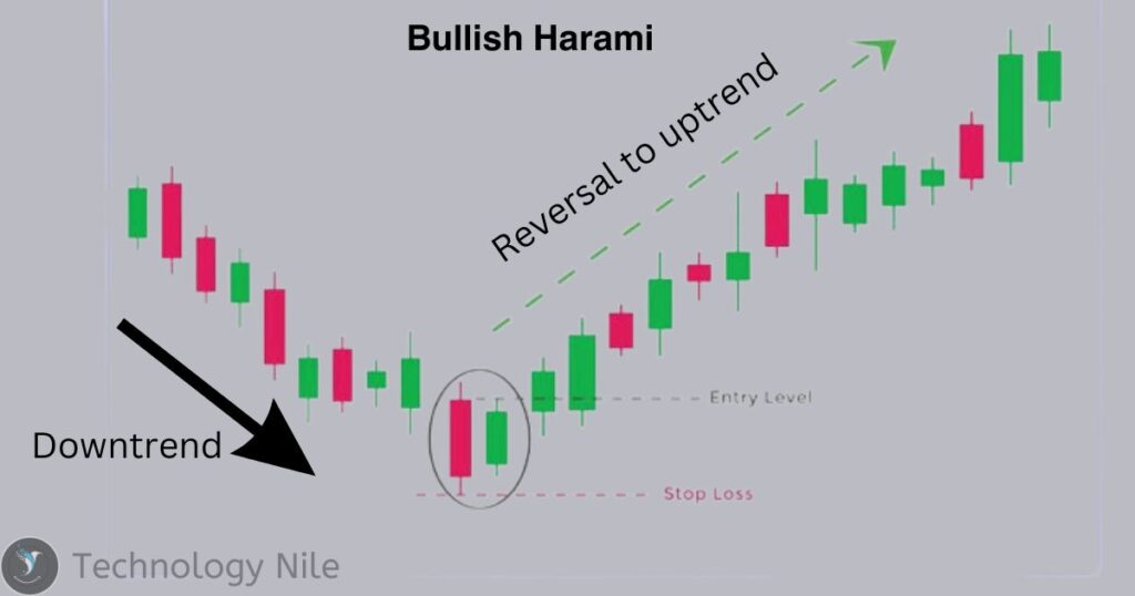
Bullish Harami Pattern
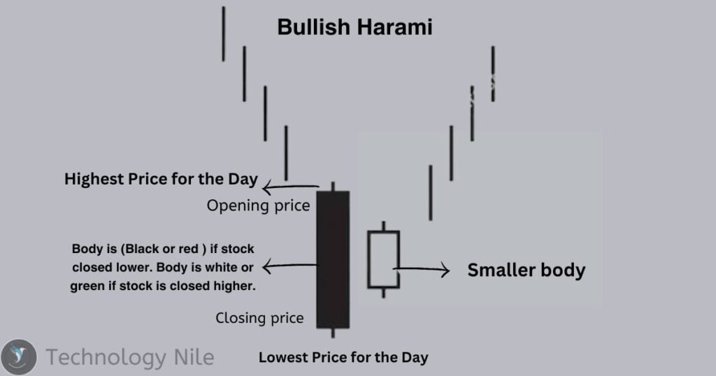
The bullish harami is a two-candle candlestick pattern that signals a potential trend reversal from bearish to bullish.
First Candle (Bearish) : This is a long red (or black) candle, indicating a strong downward movement in price. It represents the ongoing bearish trend.
Second Candle (Bullish) : This is a small green (or white) candle whose entire body is engulfed within the body of the previous red candle. This signifies a sudden shift in momentum, with buyers pushing prices back up but not yet gaining complete control.
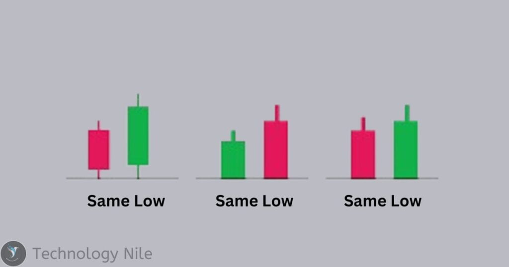
Tweezer Bottom Pattern
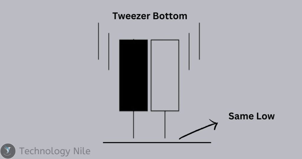
The tweezer bottom is a bullish reversal candlestick pattern that signals a potential end to a downtrend and the start of an uptrend.
First Candle (Bearish): This is a long red candle, indicating a strong downward movement in price. It represents the ongoing downtrend.
Second Candle (Bullish): This is a long green candle with a low that is very close to, or exactly the same as, the low of the first candle. This signifies a sudden buying spree that pushes the price back up, but not necessarily surpassing the close of the first candle.
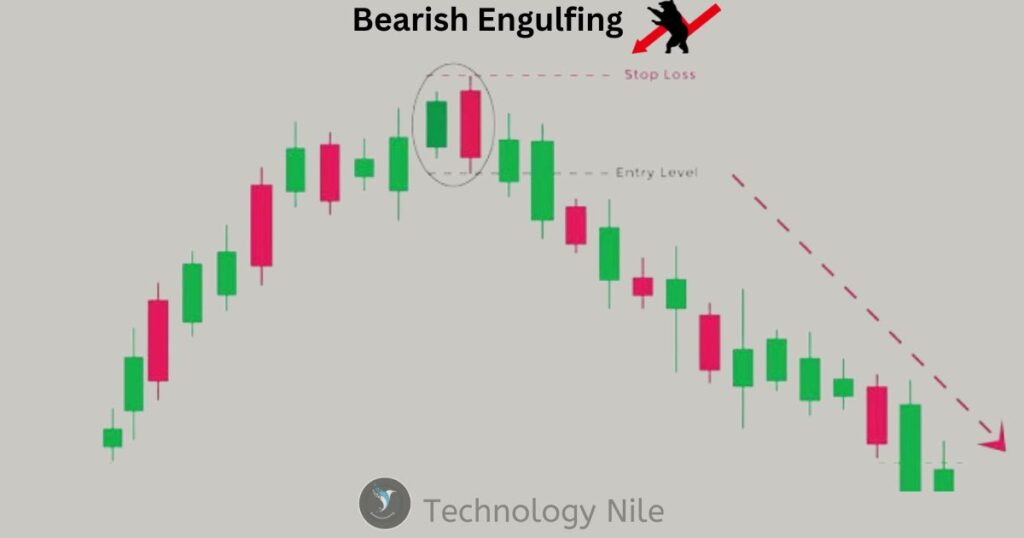
Bearish Engulfing Pattern
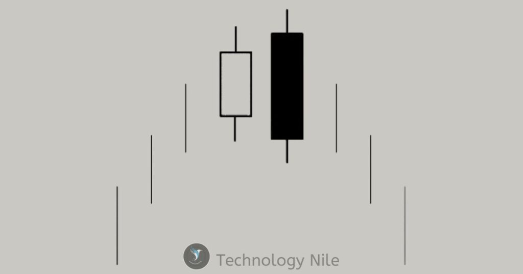
First Candle (Bullish): This is a small green candle, indicating a positive price movement and representing the ongoing uptrend.
Second Candle (Bearish): This is a long red candle whose entire body engulfs the body of the previous green candle. This signifies a sudden shift in momentum, with sellers pushing prices down and surpassing the gains of the previous day.
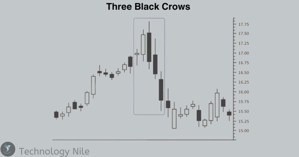
Three Black Crows Pattern
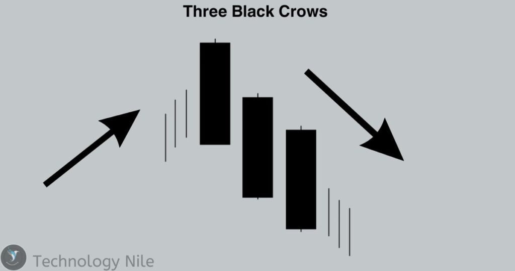
The Three Black Crows is a bearish reversal candlestick pattern that indicates a strong potential for a downtrend.
- The pattern consists of three consecutive bearish candles.
- Each candle has a long red body with short or no upper and lower wicks.
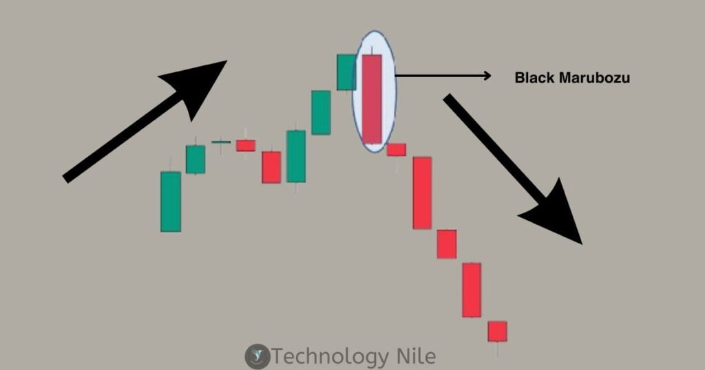
Black Marubozu Pattern
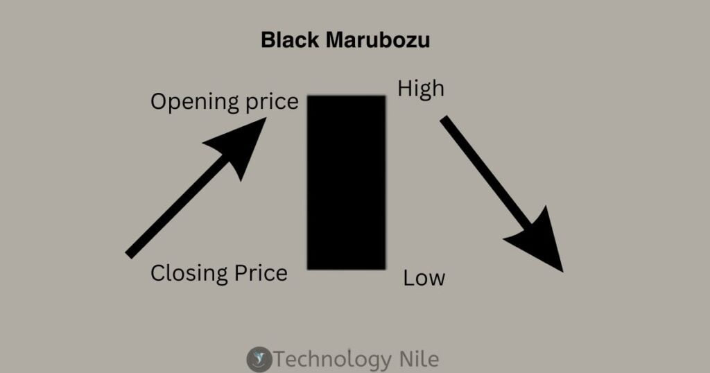
The Black Marubozu is a powerful bearish candlestick pattern signifying a strong downtrend and potential trend reversal.Imagine a solid black candle engulfing the entire trading range, symbolizing the dominance of selling pressure.
- It consists of a single black candlestick.
- The body is solid black, meaning the open price equals the high, and the close price equals the low. There are no upper or lower wicks (shadows).The candle engulfs the entire body of the previous candle, regardless of its color.
Bearish Harami Pattern
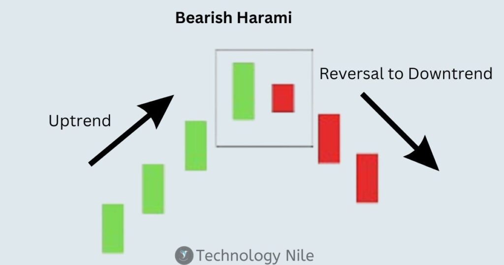
The Bearish Harami is a two-candle candlestick pattern suggesting a potential reversal from an uptrend to a downtrend.
Bullish candle: This is a long-bodied green candle, indicating strong buying pressure and the continuation of the uptrend.
Bearish candle: This is a small-bodied red candle, completely engulfed by the previous bullish candle’s body. This signifies a decrease in buying pressure and potential selling pressure emerging.
Tweezer Top Pattern
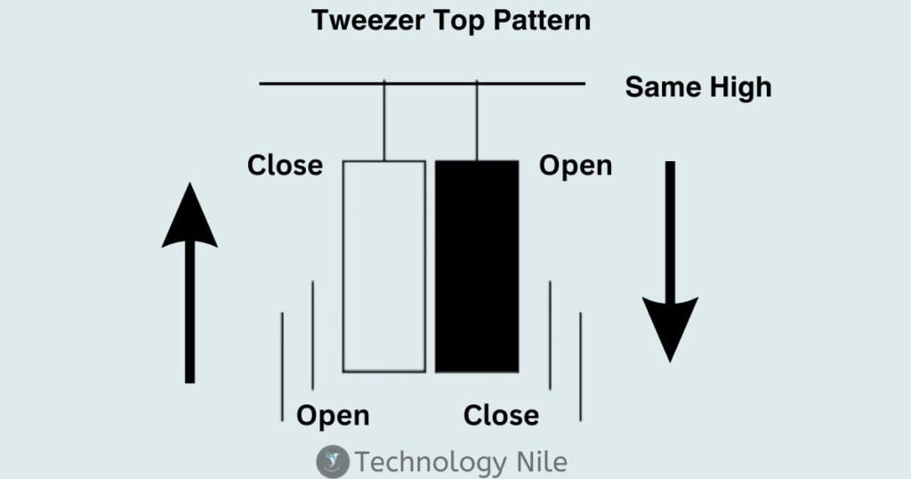
The tweezers top is a bearish reversal pattern used in technical analysis, indicating a potential shift from an uptrend to a downtrend. It’s formed by two consecutive candlesticks
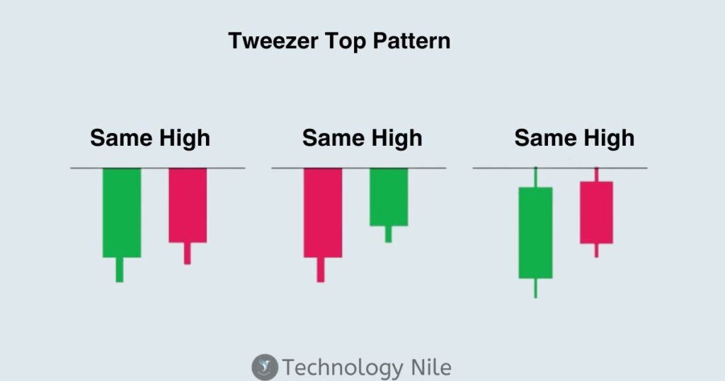
Both candles reach the same or nearly the same high price, often with prominent upper wicks (shadows).
The pattern appears at the end of an uptrend, suggesting the buying momentum might be weakening.
The colors of the candles can be any, but both should possess upper wicks.
Look for two candlesticks that appear back-to-back.
Both candles should have almost identical high points, indicating buyers failing to push the price higher.
The presence of prominent upper wicks (shadows) is crucial, signifying rejection by the buyers at that price level.
The tweezer top suggests exhaustion among buyers. They are unable to push the price higher for two consecutive periods, potentially signaling a downturn.
Ascending Triangle Pattern
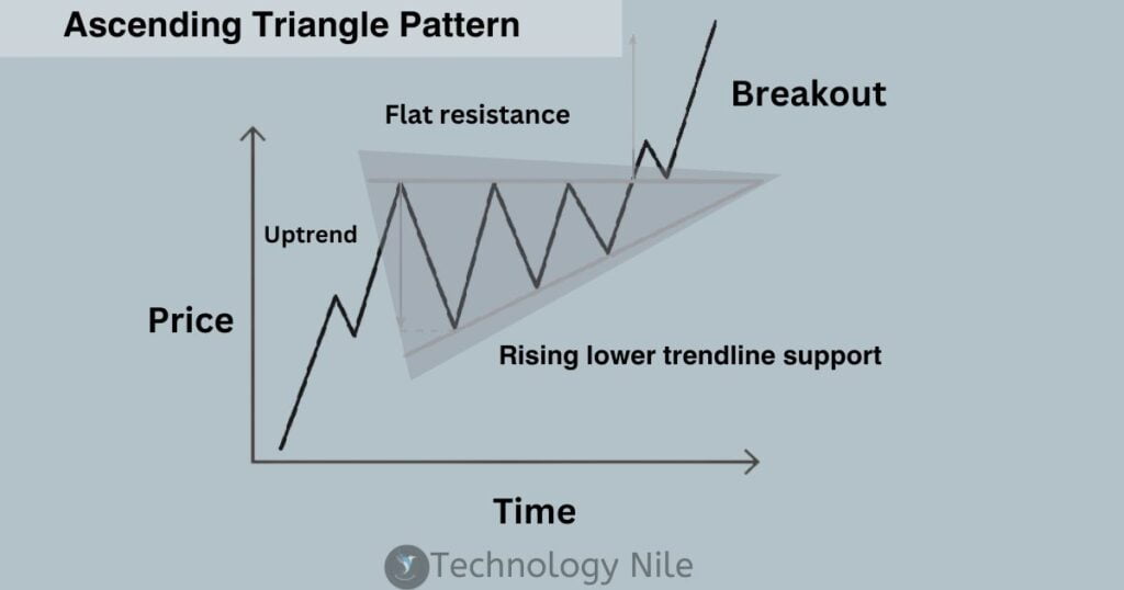
The ascending triangle is a chart pattern used in technical analysis to identify potential price movements in an asset’s price. It’s considered a bullish pattern, meaning it suggests a potential price increase.
It forms a triangle shape on a price chart.It’s created by price movements that allow for drawing a horizontal line connecting the swing highs (peaks) and a rising trendline connecting the swing lows (valleys).
They are generally considered continuation patterns, appearing during an uptrend and signaling a potential continuation of the uptrend after a consolidation period.The breakout from the triangle (price moving above the resistance line) is the key signal for traders.
Symmetrical Triangle Pattern
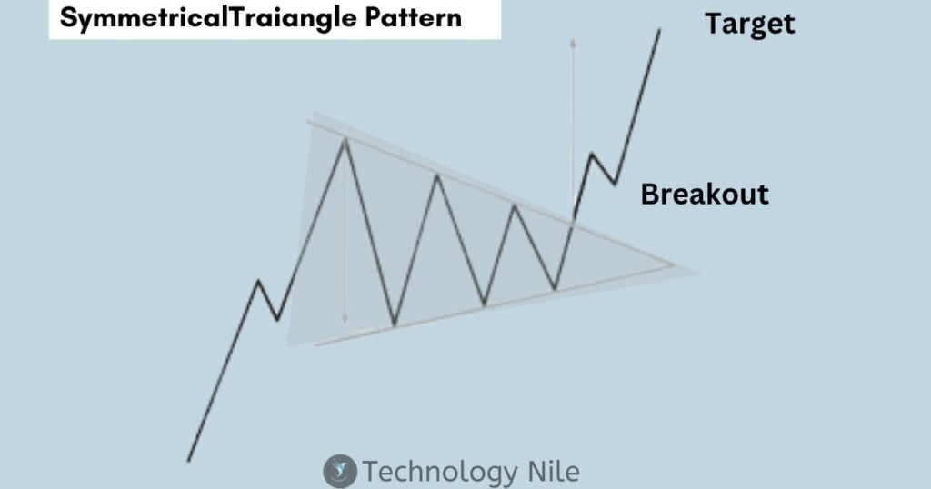
A symmetrical triangle is a chart pattern used in technical analysis to identify potential future price movements of an asset. It’s a neutral pattern, meaning it doesn’t necessarily predict if the price will go up or down, but rather that a breakout is imminent.
The key takeaway from a symmetrical triangle is the breakout, which happens when the price decisively moves above the upper trendline (bullish breakout) or below the lower trendline (bearish breakout).
Descending Triangle Pattern
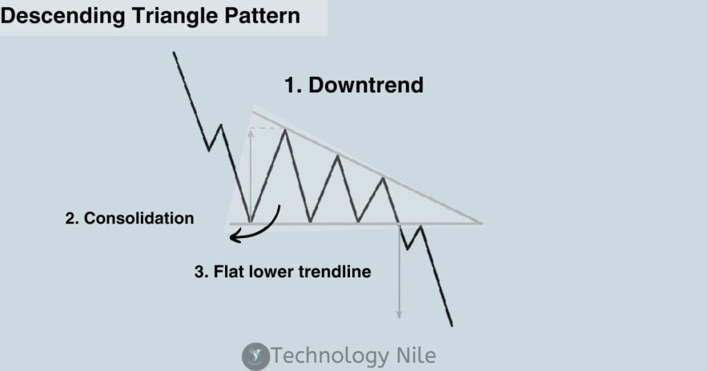
A descending triangle is a chart pattern used in technical analysis, typically seen as a bearish continuation pattern within a downtrend. It’s formed by two trendlines:
Horizontal lower trendline: This line connects a series of roughly equal lows, suggesting support from buyers at that price level.
The overall shape resembles a downward-pointing triangle, with price action getting squeezed between the converging trendlines.
Slanting upper trendline: This indicates decreasing buying pressure as each successive high is lower than the previous one.
Flat lower trendline: This suggests buyers are defending a specific price level, creating temporary support.
Convergence of trend lines: As the pattern progresses, the trendlines get closer, indicating potential breakout or breakdown.
continuation patterns within an existing downtrend. The converging trendlines suggest increasing pressure to break down from the support level.
Pennant Pattern
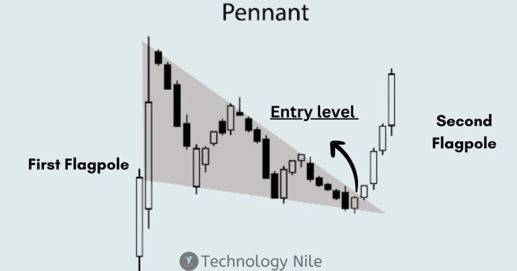
Flagpole: This is the initial strong price movement, either upward or downward, that sets up the pattern.
Pennant: This is the consolidation period, shaped like a triangle, with converging trendlines. It signifies a pause in the trend before the continuation.
Flag Pattern
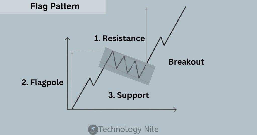
Flagpole: This is the initial strong price movement, either upward or downward, that sets up the pattern.
Flag: This is the consolidation period, shaped like a rectangle with parallel trendlines. It signifies a temporary pause in the trend.
Head and Shoulder Pattern
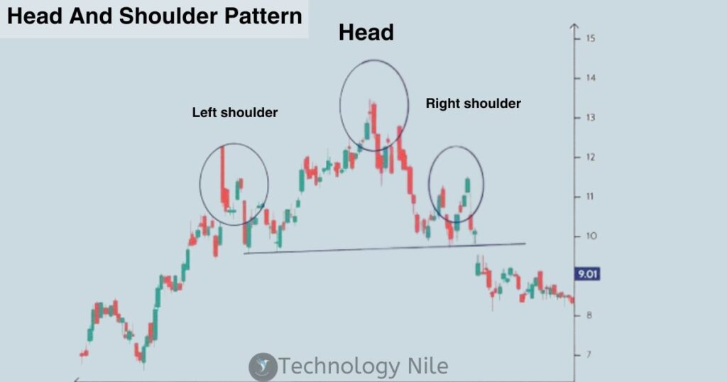
- Left Shoulder: The initial price peak, followed by a decline.
- Head: The highest price peak, exceeding the left shoulder.
- Right Shoulder: A lower price peak than the head, followed by a decline.
- Neckline: A horizontal line connecting the lows before and after the head.
Double Top Pattern
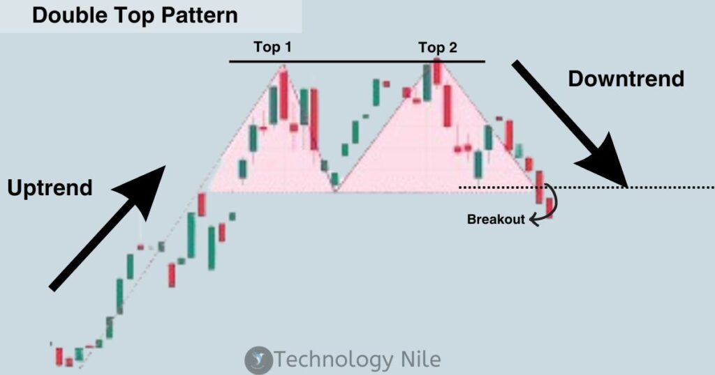
The double top is a bearish reversal pattern in technical analysis.indicating a potential downturn in price after an uptrend.
A double top pattern is a technical analysis chart pattern that signals a potential reversal from an uptrend to a downtrend. It is formed by two consecutive highs (peaks) in the price of an asset, with a trough (valley) in between, that are roughly equal in height. The pattern is confirmed when the price falls below the neckline, which is a horizontal line drawn at the
Two consecutive highs: The price of the asset reaches a high, then falls back down. It then rallies again and reaches another high, which is roughly equal to the first high.
There is a trough (valley) between the two highs. The depth of the trough is not as important as the height of the two highs.
Neckline: A horizontal line is drawn at the lowest point between the two highs. This line is called the neckline.Confirmation: The pattern is confirmed when the price falls below the neckline.
Confirmation: The pattern is confirmed when the price falls below the neckline.
Double Bottom Pattern
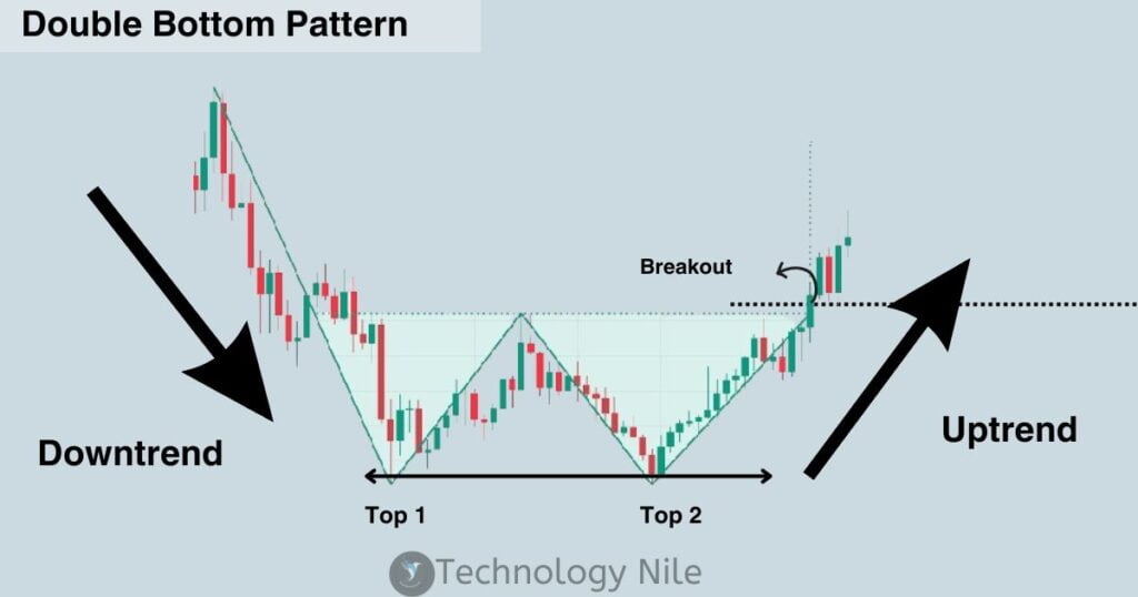
Downtrend: The pattern begins with a clear downtrend, where the price makes lower highs and lower lows.
First Dip: The price reaches a significant low point, forming the left side of the “W.”
Rebound: The price then bounces back, but fails to reach the previous high point, creating a rally.
Second Dip: The price dips again, reaching a level close to, but not necessarily exactly the same as, the first low point, forming the right side of the “W.”
Second Rebound: Finally, the price bounces back again and breaks above the resistance level created by connecting the highs of the two rallies. This breakout is the confirmation signal for the double bottom pattern.
Wedge
Rising Wedge pattern
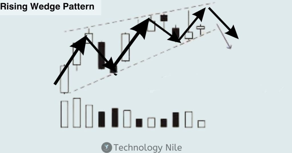
Rising wedge pattern is a bearish pattern.
Wedge Patterns are used to identify trend in technical analysis patterns formed by converging trendlines, either rising (bearish) or falling (bullish).Prices move within the channel created
Prices move within the channel created by the trendlines, indicating consolidation and potential breakout.
Breakouts above the upper trendline in rising wedges or below the lower trendline in falling wedges are considered potential trend reversals.
Falling Wedge Pattern
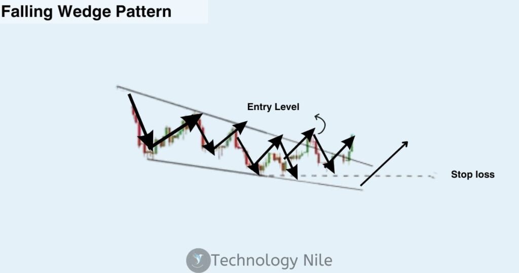
Falling Wedge is a bullish Pattern.
The falling wedge pattern is a technical analysis tool that signals a potential reversal in a downtrend.
Indicate that selling pressure is easing and a potential reversal or upward breakout may be on the horizon.
Trendlines are drawn connecting the lower highs and lower lows, forming a downward-sloping wedge pattern.
Breakout : Place a buy order once the price breaks above the upper trendline with a noticeable increase in volume.
Stop Loss: To manage your risk, set a stop-loss order slightly below the breakout point or below the lower trendline.
Rounding Top or Bottom Pattern
Rounding Top Pattern
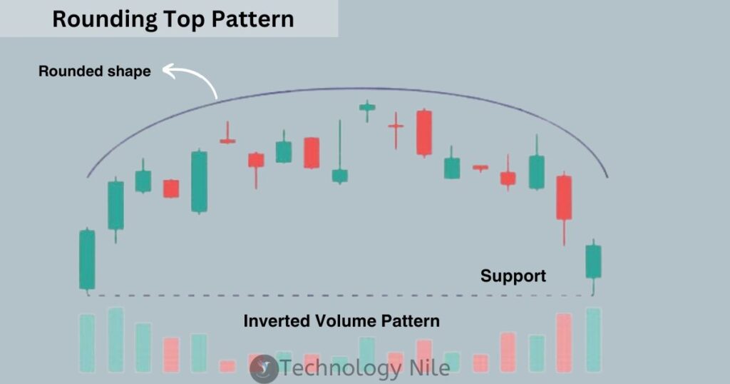
Rounding Top is Bearish reversal pattern.
- The pattern starts with an uptrend.
- The price reaches a high point, forming the rounded peak of the “top.”
- The price then experiences multiple pullbacks but fails to reach the initial peak, creating a rounded shape.
- Finally, the price breaks below the neckline, a horizontal line connecting the lows of the pullbacks, signaling a potential downtrend.
The rounding top indicates loss of momentum in the uptrend. Buyers are unable to push the price higher, and sellers gain control.
Rounding Bottom Pattern
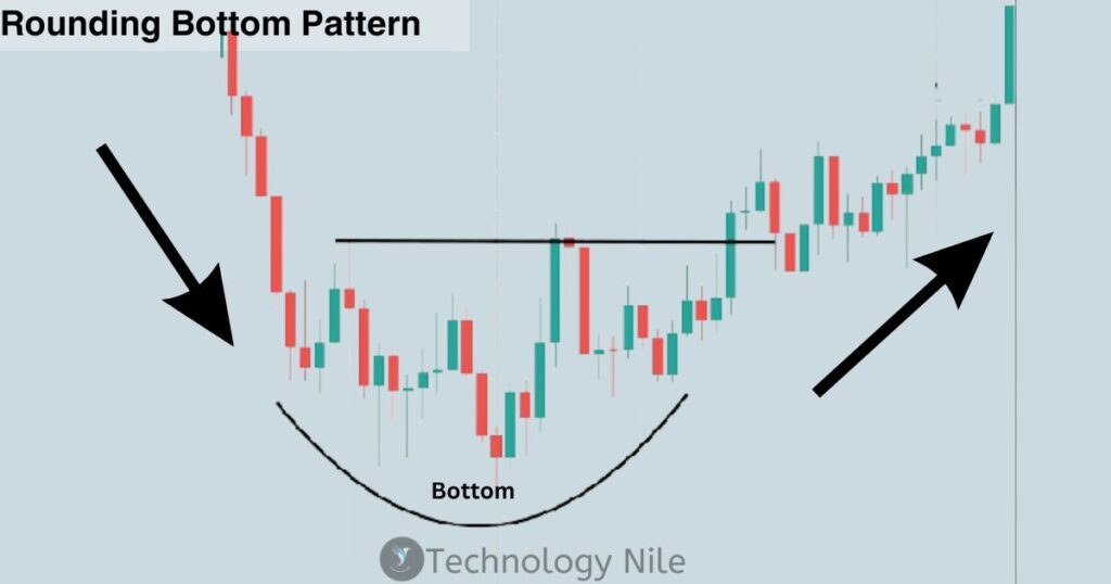
Rounding Bottom is bullish Reversal Pattern.
- The pattern starts with a downtrend.
- The price reaches a low point, forming the rounded bottom of the “bottom”.
- The price then experiences multiple rallies but fails to reach the initial low, creating a rounded shape.
- Finally, the price breaks above the neckline, a horizontal line connecting the highs of the rallies, signaling a potential uptrend.
The rounding bottom indicates increased buying pressure at the low point. Buyers are accumulating shares, potentially leading to a reversal.
Cup and Handle Pattern
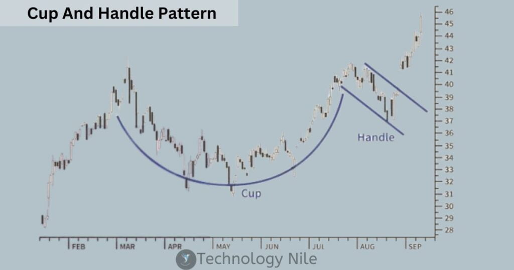
Cup and Handle Pattern is a Bullish Pattern Imagine a perfectly crafted teacup, filled to the brim with bullish potential.
- Uptrend: The price starts by rising from a previous low, forming the left side of the cup.
- Pullback: The price then dips, creating a rounded bottom like the bowl of the cup. This represents a period of selling pressure but not a complete breakdown.
- Consolidation: The price stabilizes, forming a trading range on the right side. This is the handle, where buyers and sellers wrestle for control.
- Breakout: If the price breaks above the handle’s resistance level, it signifies a potential continuation of the uptrend. This is the confirmation signal for bullish traders.
FAQ?
Q: Is a hammer bullish or bearish?
Ans. The Hammer Candlestick is a bullish Reversal Pattern. “The hammer indicates a potential shift in market sentiment from bearish to bullish.”Place a stop-loss order below the low of the hammer to manage your risk.
Q: Can a doji be both bullish and bearish?
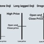
Ans. Dojis represent indecision, so they don’t inherently suggest a specific direction. However, their position within the chart context can give clues about potential breakouts.
Q: Is technical analysis with candlesticks enough for successful trading?
Ans. No, Candlesticks offer valuable insights, but incorporating other factors like fundamentals, volume, and risk management is crucial for informed trading decisions.
Q: Is candlestick trading profitable?
Ans. Candlestick patterns are a popular tool used by traders to analyze market trends and make investment decisions. However, relying solely on candlestick patterns is not a guarantee of success in trading, as it does not take into account all the various factors that influence market movements.
Q: What is the candlestick chart method?
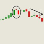
Ans. A candlestick graph displays the relationship between the high, low, opening, and closing price of a stock. The body can be long or short and red or green. Also, shadows can be long or short. A combination of these displays the sentiment of the market towards the said stock.
Q: What is option candlestick chart?
Ans. A candlestick is a way of displaying information about an asset’s price movement. Candlestick charts are one of the most popular components of technical analysis, enabling traders to interpret price information quickly and from just a few price bars.
Q: Is candlestick enough for trading?
Ans. Candlestick Charts helpful for technical analysis to identify pattern and make trading decision.
Q: Which timeframe is best for using candlestick patterns?
Ans. It depends on your trading style. Day traders focus on shorter timeframes, while long-term investors might use weekly or monthly charts. Experiment and find what works for you.
Q: I’m new to trading. Are candlestick charts too complicated?
Ans. Not at all! Start with basic patterns like hammer and doji. Practice recognizing them and then explore more complex combinations.
Q: What’s the most important element of a candlestick – the body, wicks, or both?
Ans. Both play a role. The body size reflects how strongly buyers or sellers controlled the price. Longer wicks signal potential buying/selling pressure despite the closing price. Analyze them together to understand market dynamics within each timeframe.
Q: What does a downward trendline mean?
Ans. Downtrend lines act as resistance and indicate that there is more supply than demand, even as the price falls.
Q: What does an upward trendline mean?
Ans. Upward sloping trendlines are used to connect prices that act as support, while the given asset is trending upward. This means that upward sloping trendlines are mainly drawn below the price and connect either a series of closes or period lows.
Q: Is the tweezer bottom bearish or bullish?
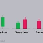
Ans. Tweezer bottom is the bullish Reversal Pattern.Occurs at the end of a downtrend.First candlestick is bearish (red).Second candlestick is bullish (green).Both candlesticks have very similar or identical lows.The tweezer bottom indicates that sellers have pushed the price lower, but buyers are stepping in at the low point. The bullish candle shows renewed buying strength, suggesting a potential reversal to an uptrend.
Q: What are the 4 parts of a candlestick?
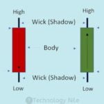
Ans. Candlestick charts are a useful trading tool as each candlestick can reveal four points of data: open, close, highest and lowest price points. Using these data points traders can interpret the price movements quickly and efficiently.
Q: What’s the difference between a real body and a shadow in a candlestick?
Ans. The real body represents the difference between the opening and closing price, showing the actual price movement during the timeframe. The shadows (upper and lower) show the highs and lows reached beyond the opening and closing prices.
Q: what is black or red Candlestick?
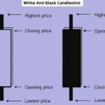
A black (or red) candlestick indicates that the closing price of a security was lower than its opening price. It signals bearish sentiment, suggesting that sellers were in control and pushed the price downward.A white (or green) candlestick indicates that the closing price of a security was higher than its opening price.It signals bullish sentiment, suggesting that buyers dominated the trading period and drove the price upward.
Q: What time frame is best for trading?
Ans. 15-minute charts and 30-minute charts are the offer optimal results. Day traders who use indicators in their day trading strategy can use a 15-minute or lower time frame. In the case of price action-based trading, a combination of the 15-minute and 30-minute time frames proves to be highly effective.
Q: What is three Black Crows Pattern with Example?
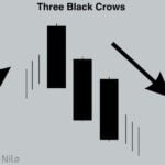
Ans. The Three Black Crows pattern is a bearish Candlestick Pattern Three consecutive long-bodied, bearish candlesticks that close near their daily lows. Each candlestick opens within the body of the previous day’s candlestick and closes lower than the previous day’s close. The pattern suggests that selling pressure is overwhelming buying pressure. After a sustained uptrend, the appearance of Three Black Crows indicates that the bulls are losing control, and the bears are taking over. This marks a potential shift towards a downtrend. Example -analyzing a daily candlestick chart for a stock that has been in an uptrend. You notice the following sequence Day 1: Open: $110Close: $115 Day 2: Open: $114Close: $111 Day 3: Open: $110Close: $106 . This pattern would represent the Three Black Crows Each day shows a strong downward move, with the closing price lower than the previous day’s close. This signals a potential reversal of the previous uptrend.
Q: Are candlestick charts better than other chart types?
Ans. Not necessarily. Each chart type has its strengths and weaknesses. Candlesticks offer a visual representation of multiple price points (open, close, high, low), making them good for identifying trends and reversals. However, they can be more complex to interpret than simpler bar charts.
Q: What does the color of the candlestick body (hollow or filled) represent?
Ans. black or filled candlesticks depict a closing price lower than the opening price (downtrend). Conversely, white or hollow candlesticks indicate a closing price higher than the opening price (uptrend). However, the color convention can vary depending on the platform you use.
Q: What is the most important element of a candlestick?
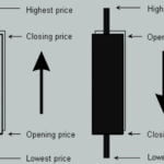
Ans. Each element (open, close, high, low) plays a role, the relationship between the open and closing prices is generally considered the most crucial aspect of a candlestick. This tells you whether the bulls or the bears were in control during that specific timeframe.
Stock Market simulator – Practice Stock Market Trading – Click here
Finance Fraud Detection – click to read
